What Are the Best Report Styles for SCCM?
When I present at conferences, such as the Midwest Management Summit, I always get asked, “What are the best report styles for SCCM?” Another question I often hear is, “What types of reports should I create?” I never get asked about what information the reports should be about, such as software updates or software inventory. This always surprises me. No, folks only want to know what style of report is the best to display SCCM information.
What is meant by, “best report styles?” Let me explain. Attendees are not talking about the look and feel of a report, such as fonts, text color, overall color schema, date and time formats, etc. Instead, they want to know whether or not visual aids (chart, graph, etc.) can be used. They also want to know if a report can list the complete details about a computer, or if it should simply list some common details about a computer item.
Here’s one of my secrets: I always tell folks that you can never create one report or dashboard. You must always create a report/dashboard set. At a bare minimum there should be at least three reports/dashboards in a set. I’ll talk much more about report styles a little later on.
SCCM
First we need to talk about System Center Configuration Manager (SCCM). Understanding SCCM’s capabilities will help define what style of reports should be used.
This is important to keep in mind: SCCM is not a real-time product, so there is no point in trying to create real-time reports. You might be saying to yourself, “What about that new feature called CMPivot in 1806?” Unfortunately, there isn’t a reporting option for CMPivot, so at best you can export the results and do something with them – like create a report set!
Also it is important to remember that the SCCM database is huge. At a maximum, it can contain information on about 400,000 computers, so it wouldn’t make sense to list everything you know about every computer in one report. Could you imagine how big a report would need to be in order to list all of the information about 400,000 computers? All CPUs, all hard drive details, all software, all software updates, etc.? That report would be hundreds of millions of lines long!
Even if you work at a small organization with around 30 computers, it still doesn’t make sense to create a report that contains every piece of data found about each computer in SCCM. Take it from me, if you try to create a report like that you will overwhelm the person trying to read it with information overload.
Equally important to remember is how the performance of SQL Server will be negatively impacted when you execute a query for that amount of information. It could lead to the SQL Server crashing or it could cause intermittent problems where the source of the problem is not identifiable. Not being able to pin-point the cause of a problem is a major headache!
Focus Area
How do you display SCCM information in order not to overwhelm the reader or effect the performance of SQL Server? Start by selecting a focus area in order to limit the amount of information. This will help to ensure that you are not overwhelming the report’s reader or SQL Server.
In the following examples, I’ll use Microsoft Office as the focus area for my report set. What do you care to know most about this software? I’m going to say that you’ll probably want to know how many different versions of Microsoft Office are in your organization.
Best Report Styles
In answer to everyone’s question, the best report styles to display SCCM information are the dashboard, a list report and a detail report. In fact, all three should make up you report/dashboard set. Read below to find out more about each one.
Dashboards
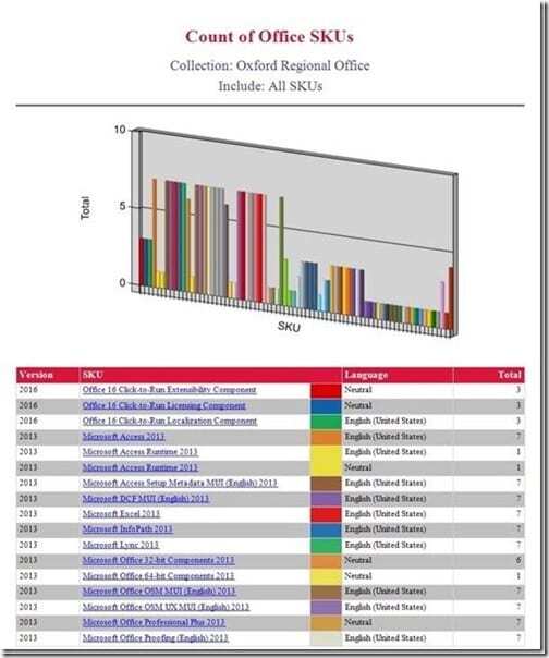
I always want to know the total number of licenses I have for each version of any software in my environment. Given that I want to know the total number of several different versions of Microsoft Office, I will display the information in a dashboard report which I sometimes refer to as a count report. Displaying this high-level information in one dashboard will quickly show any reader the total count of several different software license versions.
Most often than not, you’ll see visual aids such as bar charts, pie charts, donut charts, and choropleth maps used in dashboards. Besides these visual aids, I also like to include a table with a summary of what is displayed in the chart of a dashboard report. See the screenshot below. This allows the reader to see the information in a graphic format first and then they can review the data in the table.
List Reports
It’s great to see how many computers have Microsoft Office 2013 licenses, but what the dashboard doesn’t tell me is exactly which computers have Microsoft Office 2013 installed on them. This is where the list report comes into play. From my dashboard I can select a SKU hyperlink in order to get to another report with this information (see the screenshot below).
List reports generally are in a table format with just the right amount of columns to display important details about computers and users. In this case all of these computers have Microsoft Office SKU: Microsoft Access 2013 installed. That specific SKU along with the column headings is the focus area of this report.
Detail Reports
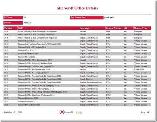
Given that you don’t want to overwhelm your reader with potentially unnecessary information, list reports shouldn’t display all of the details associated with an individual computer. Instead, this type of information should be found within the last report of your report set. I like to call this report a detail report. It closes the loop from the dashboard by displaying all of the finer details associated with an individual computer about the focus area. This report can also be in a table format, but sometimes it’s not.
Looking at the screenshot below, you can see what other Microsoft Office products are installed on one computer.
Knowing all of the information found in this report set allows an IT Manager or SCCM Admin to make an informed decision about whether a license needs to be upgraded, or if they should remove redundant software. Nowhere along the report set is the reader overwhelmed with more information than they need. Each dashboard and report is focused.
What Are the Best Report Styles for SCCM?
The best report styles to display SCCM information are the dashboard, a list report and a detail report. I always recommend that you do all three together in a report/dashboard set. Make sure to select a focus area. I can’t stress enough how important it is not to overwhelm the reader with too much information. You must also take into consideration SQL Server performance. Your queries shouldn’t put any stress on the SQL Server. As I noted before, trying to put too many details into one dashboard or report will affect the SQL Server. Instead, put information into bite-sized chunks. This not only reduces the stress on the SQL Server, but it also gives useful data to the end user.
You will find that these endpoint management software reports follow this logic. Our reports ensure that you quickly understand a specific focus area in your environment. They provide you with business intelligence which will ultimately allow you to make better informed decisions.
Additional Reading
Are you looking for additional reading on SCCM reporting?
If you have any questions about the best report styles for SCCM, please feel free to contact me @GarthMJ.


